Learning Objectives
-
Add a UIView as a subview to an existing view controller superview and constrain interface objects to this subview.
-
Learn to make context-specific user interface changes, to show a navigation item’s < Back button when a value cannot be edited, but show Save and Cancel buttons when editing can occur.
-
Learn to remove a background color using UIColor.clear.
-
Learn to hide and show a toolbar associated with a navigation controller.
-
Create a convenience initializer to vary parameters that need to be passed when initializing an object of a custom class type.
-
Extend UIView with a custom method that can add a border to any user interface object that is a subclass of UIView.
Video Lesson
Reference
Creating a subview within a view controller’s view
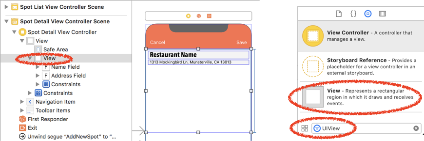
You can add a subview inside of a view controller’s main View. Simply add an object of type “View” (which can be found more easily by typing “UIView” into the object filter). This “subview” will be inside of the main view. You can add additional objects inside of the subview, and any constraints applied to these objects will be relative to the subview. This can be convenient if you want to group various items together, especially if you want to move them as one throughout your user interface. In a future video we’ll use the subview we created to move a group of objects inside a table view header.
Context-Sensitive Customization of the Navigation Item: Add vs. Show
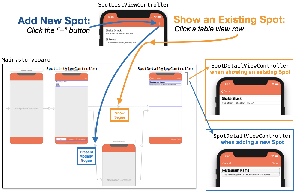
When adding a new record, an app likely wants to offer the user a “Save” and “Cancel” option (the blue path, shown below), however when showing an existing record that cannot be modified, the navigation item likely will only show a “< Back” button (the orange path, shown below).
The image below shows an example of how this was achieved in our video lesson. Pressing “+” in the SpotListViewController will Present Modally segue via a navigation controller to the SpotDetailViewController and will show the “Cancel” and “Save” bar button items in the navigation item (below right, in dark blue box). However, pressing a cell in the table view in SpotListViewController performs a Show segue directly to SpotDetailViewController, with “< Back” showing in the navigation item (middle right, in orange box).
To achieve this effect:
-
Add a Cancel and Save bar button item to the navigation item inside the destination view controller (this would be SpotDewtailViewController in our example).
-
To show the “< Back” control, select the navigation item in the view controller, then check “Left Items Supplement” (see image, below).
Context-sensitive customization of the UITextFields background color
Our video lesson changed how the name and address text fields are presented, depending on whether a new item is being added, or an existing item is being shown. For existing items that cannot be edited, the text fields are disabled, there is no background color, and the fields aren’t surrounded by a border. This makes the text fields look and behave as if they were uneditable UILabels.
However, when adding a new item, the text fields are enabled, they show a gray background, and they are further highlighted with a modest border framing each field. To achieve this effect:
-
Add a background to the text fields that are editable by default (the color “Mercury” in our case at 50% opacity).
-
When text fields cannot be edited, set their .isEnabled property to false and set their .backgroundColor property to UIColor.clear (no background color).
Creating an Extension to add a border to a UITextView (or any other subclass of UIView)
Extensions can be used to extend the capabilities of existing classes, structs, and (although we haven’t used them) enums and protocols. In our video lesson we created an extension to the class UIView that included a new function that hadn’t previously existed: addBorder. Our addBorder function accepted two parameters, a CGFloat value for the width of the border, and a CGFloat value for the radius, or curve of the border. Since UIView is a superclass to all of the UI classes used in the user interface (e.g. UITextField, UITextView, UIButton, UILabel, etc.) we can call our new .addBorder method using dot notation after any object that is a subclass of UIView.
Many programmers use the file naming convention for extensions as: ClassName+extensionName.swift, where class name is the class (or struct, enum, or protocol) being extended, and extensionName is the extension added (e.g. the new method, property, etc). In our video lesson, we used this convention to name our extension file: UIView+addBorder.swift. The text of this file is shown below. Note that while most new .swift classes begin with an import Foundation statement, we used import UIKit because this file needed to refer to items included in the user interface toolkit:
The borderWidth, borderColor, and cornerRadius properties are accessed within the view’s .layer property. The .borderColor needs to conform to type CGColor, where we previously used UIColor, however UIColor has a method .cgColor which will provide a the needed type conversion.
The example above also shows initializing a new color using red, green, blue, and alpha values. While 0, 0, 0, returns UIColor.black, we could just as easily have customized a color to something that is normally not as a named UIColor by setting these values.
Examples of using the .addBorder extension on UITextFields values named nameField and addressField are shown below:
Convenience Initializers
Every Swift class must have an initializer that initializes all of the parameters of that class (this is known as the designated initializer). However, you can create additional initializers, known as convenience initializers, that can set up default or calculated values when passing in a subset of the class’s properties, or even no properties at all. You can create one or more convenience initializers, but each convenience initializer must call the primary initializer, passing in a value for each of the properties that needs to be initialized. There are some additional rules for initializers that apply in cases of inheritance and subclassing, but we aren’t concerned with these in this lesson. For more detail see Apple’s Swift page on initialization.
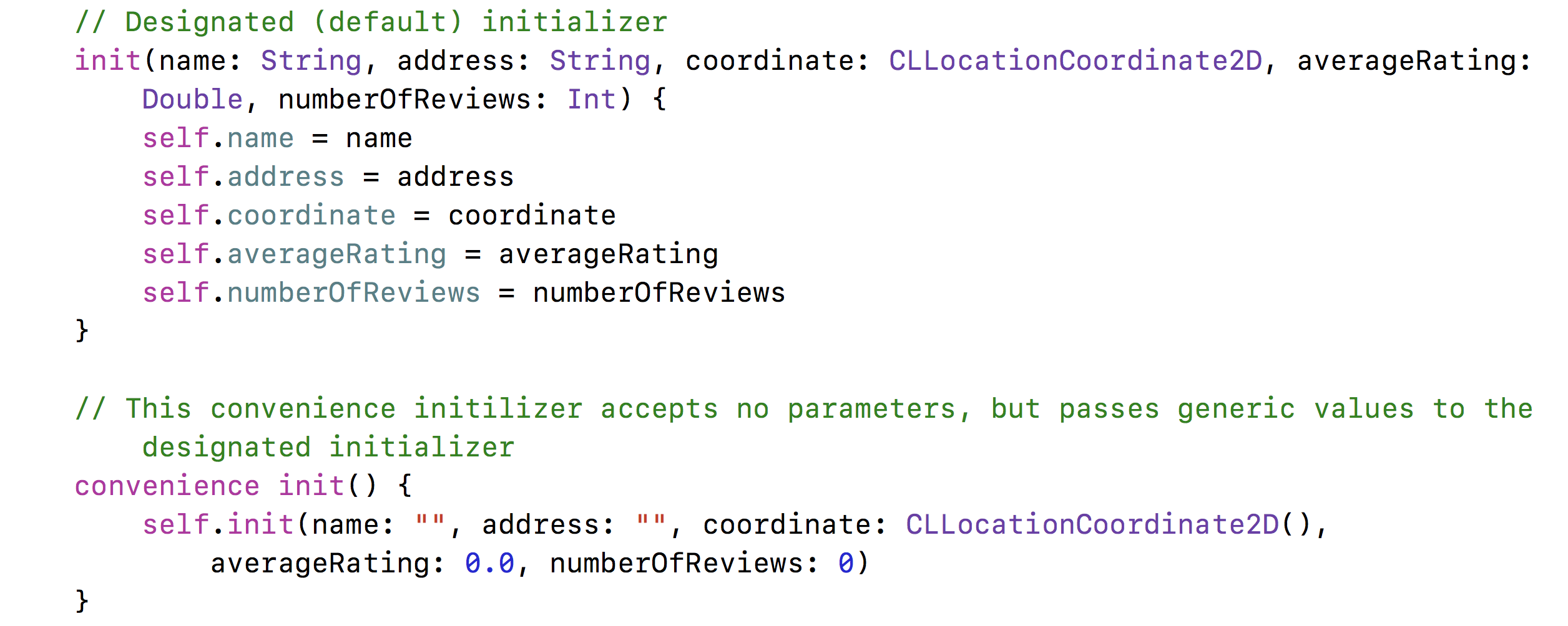
In our video lesson we created a convenience initializer for the Spot class that accepted no parameters and initialized the values of a new object of the Spot class with empty Strings, a generic CLLocationCoordinate2D, and zero values. When we add new properties to our Spot class (which we’ll do in future lessons), we can keep our no-parameter call to Spot(), but make all changes to the single Spot.swift file. The code for our designated and convenience initializers is shown below. Note that the convenience initializer calls the designated initializer through self.init, and passing in values for all of the class’s properties that need to be initialized.
Showing and Hiding the navigationController’s toolbar using .setToolbarHidden
A toolbar associated with a navigation controller can be hidden or shown using the method .setToolbarHidden. This method accepts a Bool value, true to hide, false to show, plus a Bool value indicating whether or not the change should be animated. In our video lesson, we used this method to hide the toolbar and it’s “Lookup Place” bar button item when we were showing an existing item that should not be edited.
Be careful – if you hide a toolbar, if you segue to another view controller, any toolbars may remain hidden. You can simply show the toolbar by passing false into .setToolbarHidden
Showing and Hiding the navigationController’s toolbar using .setToolbarHidden
A toolbar associated with a navigation controller can be hidden or shown using the method .setToolbarHidden. This was used to hide the toolbar and it’s “Lookup Place” button when we were showing an existing item that should not be edited.
Be careful – if you hide a toolbar, if you segue to another view controller, any toolbars may remain hidden. You can simply show the toolbar by passing false into .setToolbarHidden
Key Takeaway
-
Any view can contain subviews that can, in turn, contain additional user interface objects. Objects inside of a subview can be constrained (pinned) to that subview so that moving the subview will move all constrained objects within it, keeping them together and retaining their relative positioning.
-
Bar Button Items do not have an .isHidden parameter, but you can set a bar button item’s .title parameter equal to an empty String to achieve the same result.
-
To show the “< Back” button, select a navigation item within a view controller, then use the attributes inspector to check the Left Items Supplement box.
-
You can create an extension to any class, struct, enum, or protocol to add methods, calculated properties, and other capabilities. The naming convention many developers adopt is ClassName+extensionName.swift
-
Adding an extension to UIView will make this extension available to all subclasses of UIView, such as UITextField, UITextView, UIButton, UIImageView, etc.
-
Convenience initializers can be created to create an instance of a class or struct that has a different set of parameters (or no parameters) that the default or designated initializer. All convenience initializers must call the designated initializer, passing in a value for all properties in the class that require initialization.
-
The navigationController’s .setToolbarHidden method can be used to show or hide a toolbar associated with a navigation controller. If a toolbar is hidden, beware that you may need to use .setToolbarHidden to false when segueing to other view controllers that should show the toolbar.


